MAG'D
Branding + UI design
/
University
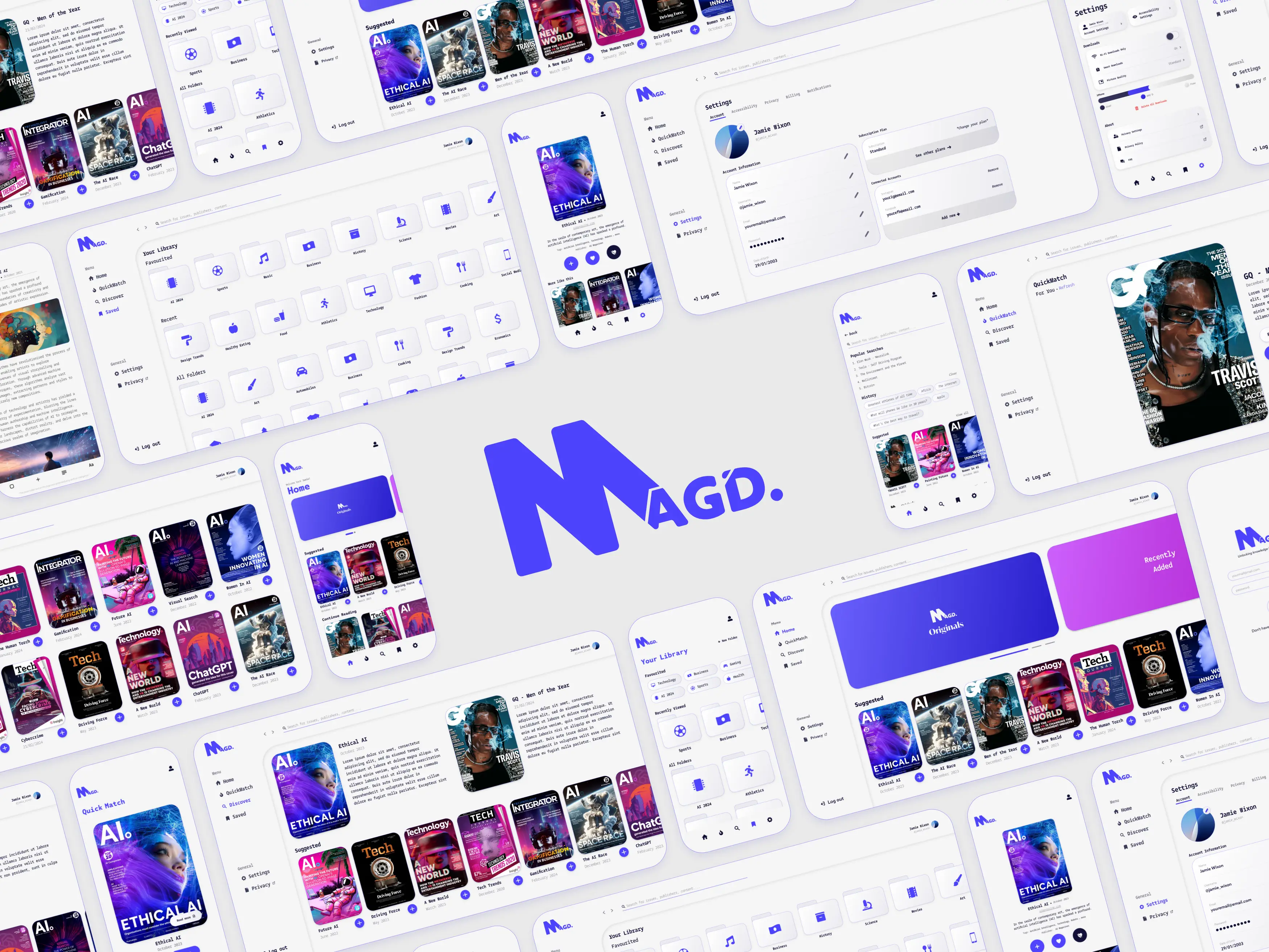
MAG’D was an inclusive digital magazine platform designed to make reading more accessible for people with ADHD, dyslexia, colour blindness, and visual impairments.
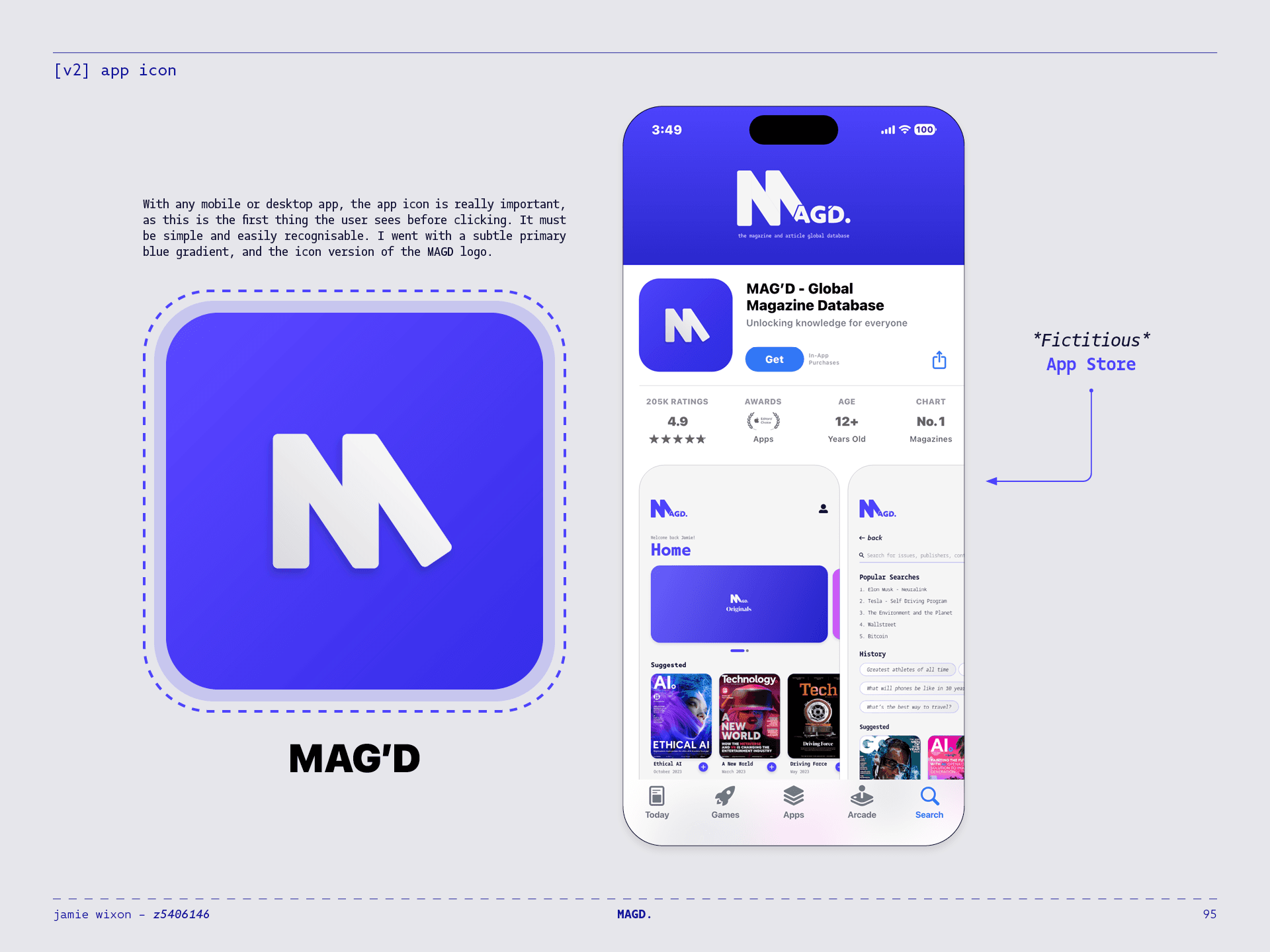
I developed the project from its initial concept through to a complete visual identity and high-fidelity mobile and desktop prototypes. Through research, user testing, and multiple rounds of iteration, I explored how one reading platform could adapt to the needs of different users.
A GLOBAL MAGAZINE LIBRARY
MAG’D brought magazines and articles together within a single subscription-based digital library.
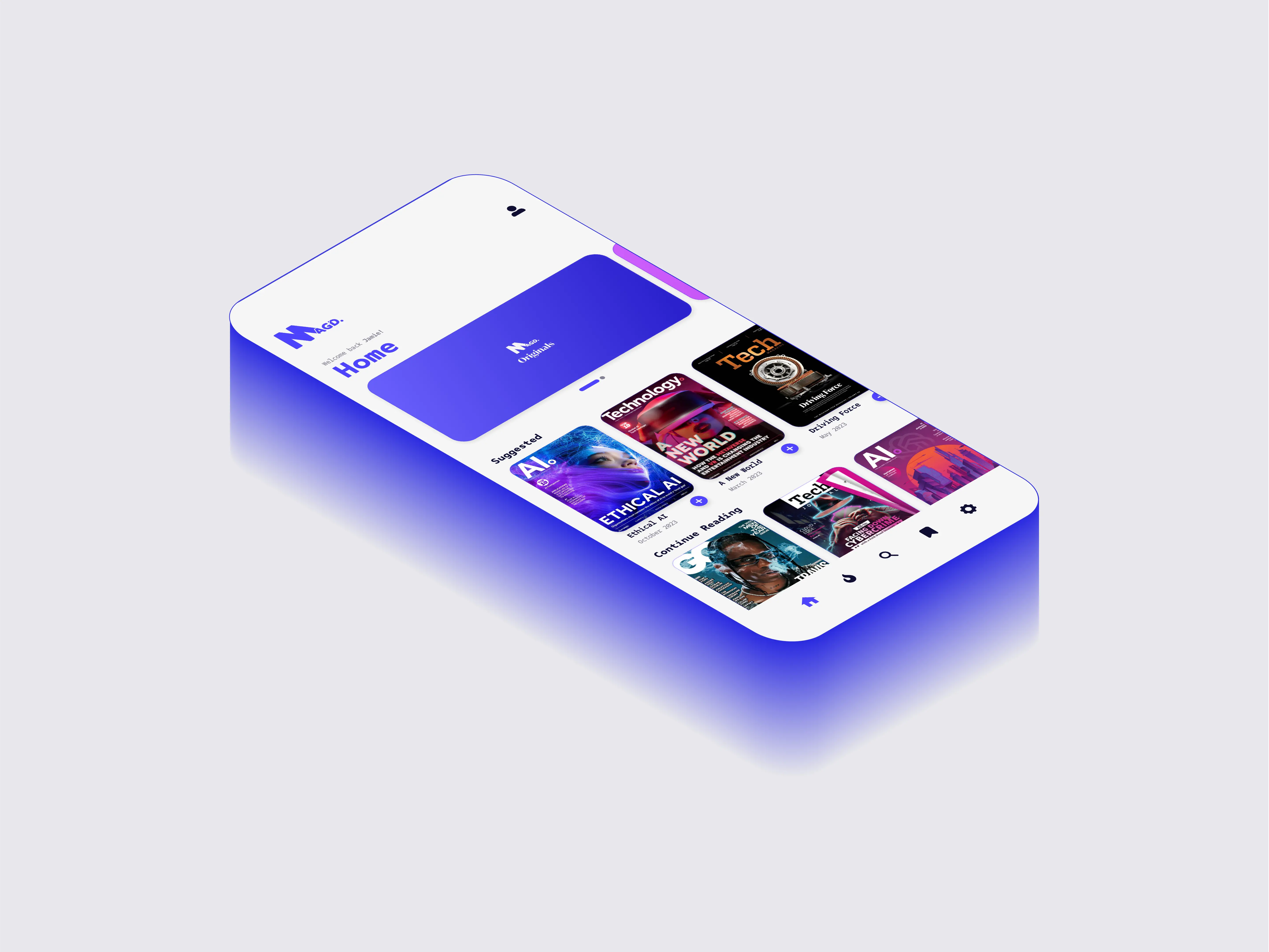
The experience was designed around discovering, organising, and reading content across mobile and desktop, with personalised recommendations and customisable library folders.
ACCESSIBILITY FROM THE START
A guided onboarding flow asked users about their individual reading needs before tailoring the interface around their responses.
This allowed accessibility features to be configured from the moment an account was created, reducing the need to search through settings before beginning to read.
A READING EXPERIENCE THAT ADAPTS
MAG’D included adjustable text sizing, high-contrast and colour-blind modes, simplified layouts, OpenDyslexic typography, and Bionic Reading.
These features could be combined to create a reading experience suited to each user, with frequently used controls available directly from the reader.
DESIGNED ACROSS DEVICES
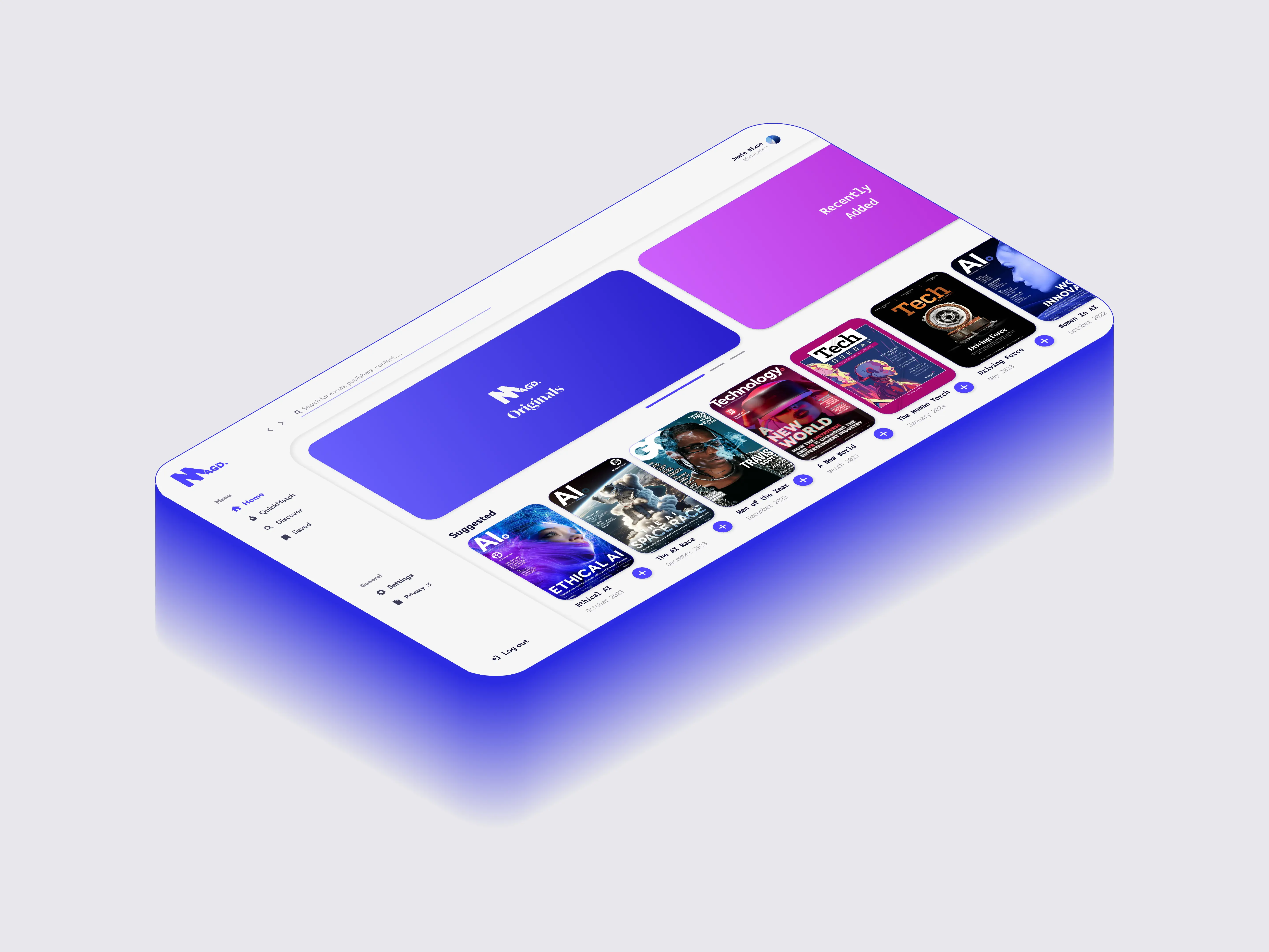
The mobile experience established the core design system and interaction patterns before being translated into a responsive desktop interface.
Both versions shared a consistent structure while making use of the space and navigation patterns unique to each device.